
Pricing KPIs
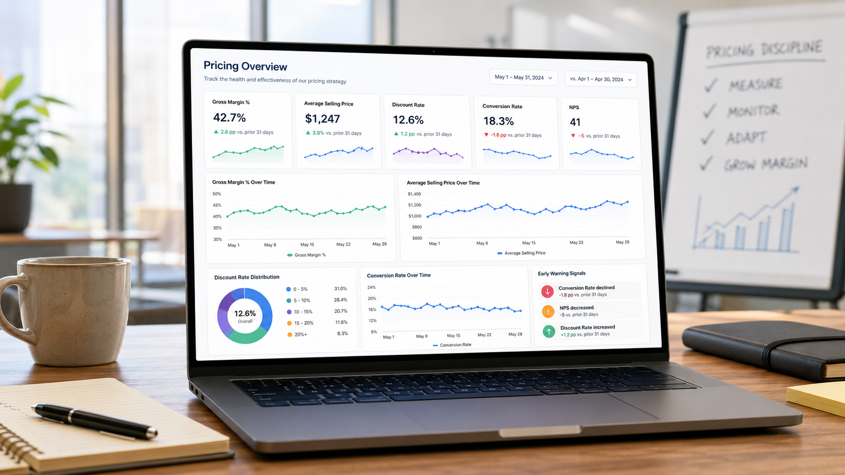
I have written previously about the importance of testing. If you change a price, or change something around the price such as how value is communicated, how do you know if it has worked? How big an impact has it had?
But testing is just a one-off. It establishes whether an idea is worth continuing or worth rolling out to all products/services.
Just as important is know what is happening day-to-day or week-to-week. Are things on track, or do prices need to be nudged again? Does the customer-facing team need new instructions? To understand these things you need relevant metrics or KPIs.
There are a huge number of potential KPIs that could be used. The following list are some of the most important…
Basic Metrics
Gross profit margin
Net profit margin
Customer lifetime value
Pricing Execution Metrics (per product or service; or per product or service category; or per customer type; or per channel)
Average selling price
Price realisation rate
Average discount rate
Days since last price increase (per SKU/service and average)
Market Metrics
Competitor price tracker
Business Metrics (which are influenced by price)
Conversion rate
NPS
Let’s dive into all these in more detail:
1. Basic Metrics
These are fundamental. You don’t have to measure all three, but you absolutely should be measuring at least one.
Gross profit margin
What it is
Gross profit margin is the percentage of revenue left after deducting the direct cost of producing or delivering what you sell – typically cost of goods sold (COGS) for a product business, or direct service delivery costs for a service business. It is the first, and crudest, way of assessing whether pricing is doing its job: it tells you what proportion of every pound of revenue is available to cover overheads, sales and marketing, and profit.
The formula is straightforward:
Gross profit margin = (Revenue – COGS) / Revenue
Assuming you don’t change what gets included in COGS, and assuming that input costs haven’t changed, then any increase or decrease in gross profit tells you that something positive or negative is happening to price.
How to measure it in practice
Pull gross margin from the P&L, but don't stop there – the aggregate number hides more than it reveals. Break it down:
By product/SKU, product line, and category, so you can see which parts of the range are propping up the average and which are dragging it down
By customer, customer segment, or channel, since the same product can carry very different margins depending on who is buying it and through what route
Over time, ideally monthly, so a pricing change shows up as a visible step or trend rather than being buried in a quarterly or annual figure
The most useful practice is to build a gross margin report, particularly by SKU and by customer segment, and to produce this monthly alongside sales and other reporting. This is probably not an issue – very few companies do not measure gross margin frequently, sometimes as often as daily!
Net profit margin
What it is
Net profit margin takes gross margin a step further by deducting all remaining costs – overheads, sales and marketing spend, finance costs, tax – to arrive at the percentage of revenue that ultimately falls to the bottom line.
Net profit margin = Net profit / Revenue
For pricing purposes, net margin is a useful sanity check rather than a primary diagnostic tool. Because it absorbs so many costs that have nothing to do with pricing decisions (headcount changes, salary changes, marketing campaigns, one-off costs), it is a noisy signal for isolating the effect of a specific price change. Its value is in confirming that gains made further up the P&L – in gross margin, for instance – are actually surviving the journey to the bottom line, rather than being absorbed by cost growth elsewhere in the business.
However, for the business, this is obviously the most important metric.
How to measure it in practice
Net margin is typically measured at the whole-business level. Because it's a lagging, aggregated measure, don't try to attribute short-term movements to a single pricing tactic – instead, use it as a periodic (monthly or quarterly) check that pricing gains are showing through, and as a way of catching cases where a pricing win at the gross margin level is being quietly eroded by cost-to-serve or overhead growth. If net margin isn't moving the way gross margin suggests it should, that's a prompt to look at cost-to-serve by segment, not a reason to doubt the pricing work itself.
The greatest value lies in analysing net margin by SKU, or by product category, or by service line, or by channel, etc. In other words, getting a really detailed picture.
The approach described below would be the same for service lines, channels or whatever, but the details would change. Let’s use a per-SKU version as an example?
The starting point is to split all costs into fixed vs variable. Fixed are typically shared on a per-revenue basis across all SKUs. Variable then are allocated based on criteria that drive actual costs. For example, the most important variable costs might be sales salaries, warehouse salaries, warehouse storage, and carriage.
Taking each in turn…
Sales salaries
You might have three channels to market. Some SKUs are sold through the website, some to a couple of wholesalers, and some direct to a large number of customers. Each SKU would have a ‘channel’ field in the database (or spreadsheet), which says either ‘online’, ‘wholesale’ or ‘direct’. Sales costs might be apportioned 0% to the online sales, 23% to the wholesale sales (based on the amount of sales time devoted to wholesalers), and 77% to direct. Those costs would then be spread across the actual SKUs in each category – so the 23% of sales costs are shared between the SKUs that are sold via wholesalers on a per-sale basis, so for each SKU you will need to measure the total volume and the typical number of SKUs per order.
This can get complicated (for example, what if SKUs are sold through multiple channels), but once the algorithm is worked out you don’t need to do it again – you just plug in new numbers each month.
Warehouse salaries
Similar to sales, the key cost driver might be whether a SKU arrives in big boxes with lots in a box which need to be broken down to individual units, vs SKUs that arrive just 1 per box; and SKUs. Again, SKUs are categorised and costs allocated on a per delivery basis.
Warehouse storage
For each SKU you would measure the length, width and height, and then calculate the share of space it typically takes up; then allocate costs based on space.
Carriage
Finally, carriage probably is based on volume, so the same length/width/height data would be used to calculate a share of pack space per order shipped for small items, and a different share of pack space cost used for bulky items which attract special carriage fees.
This is a complex analysis to get right, but it gives you the absolute best data to understand the true net margin per SKU, channel etc. The basic process is to:
1. Understand and categorise costs
2. Understand each of the factors that drives costs
3. Work out the best way to allocate each cost
4. Do a sense-check to make sure all the costs add up to the same totals as in the P&L
Customer lifetime value
What it is
Customer lifetime value (CLV or LTV) estimates the total profit a business can expect to earn from a customer over the entire course of the relationship, not just from a single transaction. It matters for pricing because many pricing decisions – a lower price to win a customer, a discount to secure a first order, an investment in onboarding – only make sense when judged against the full value of the relationship rather than the margin on the first sale.
A common formulation:
CLV = (Average order value × Purchase frequency × Gross margin %) × Average customer lifespan
If you have the data, you can use net margin instead of gross margin to get a truer picture of CLV.
More sophisticated versions discount future cash flows to present value, or use cohort-based survival curves rather than a single average lifespan, particularly in subscription or contract-based businesses where churn behaviour varies significantly by cohort.
How to measure it in practice
Start simple and refine only if the business model warrants it:
For repeat-purchase or subscription businesses, calculate CLV by customer cohort (e.g. customers acquired in a given month or quarter), tracking actual retention and spend over time rather than relying purely on averages – average lifespan figures can be badly distorted by a small number of very long-tenured customers
Segment CLV by acquisition channel, product line first purchased, or price point at acquisition – this is where CLV becomes genuinely useful for pricing decisions, because it lets you test whether customers acquired at a lower price behave differently (in retention, upsell, or basket size) from those acquired at full price
Recalculate periodically (quarterly is typical) rather than treating it as a fixed number, since retention and margin assumptions shift as the business and market evolve
The key practical discipline is resisting the temptation to use CLV to justify discounting after the fact. Set the CLV assumptions and the payback threshold before a pricing or discounting decision is made, then track actual cohort behaviour against those assumptions to confirm – or challenge – the original logic.
A quick digression on ‘cohort based survival curves'
The problem it solves
The simple CLV formula assumes every customer has the same average lifespan – you take one number (say, "customers stay 4 years on average") and multiply it through. But average lifespan is a fragile number. It's usually calculated from customers who have already churned, which skews it towards shorter-tenured customers – the ones still active haven't finished their "lifespan" yet, so they're often excluded or mishandled in a simple average. It also collapses a huge amount of variation into one figure: some customers churn in month two, others stay for a decade, and a simple average tells you nothing about that spread or about when the risk of losing a customer is highest.
What a survival curve actually is
Borrowed from medical statistics (originally used for literal patient survival analysis, hence the name), a survival curve plots the probability that a customer is still active as a function of time since acquisition. You start at month 0 with 100% of a cohort still active, and the curve traces downward as customers churn – month 1, 90% remain; month 6, 70% remain; month 24, 45% remain, and so on, until it flattens out towards whatever your long-term "core" retention rate is.
The shape of that curve is the valuable part. A steep early drop-off followed by a long flat tail tells a completely different story from a slow, steady decline – even if both curves happen to average out to the same "mean lifespan". The first pattern says: get customers through the first few months and you've largely got them for good, so the whole retention effort should focus on onboarding. The second says churn risk is fairly constant throughout the relationship, so retention needs to be a continuous effort, not a front-loaded one.
Why "cohort-based"
You build a separate survival curve for each acquisition cohort – customers acquired in January, customers acquired in February, and so on; or customer acquired through the website, customer acquired through outbound email; etc – rather than one blended curve for the whole customer base. This matters for pricing specifically because it lets you compare curves across cohorts that were acquired under different conditions. For example:
Customers acquired at a discounted introductory price vs customers acquired at full price
Customers acquired through a paid channel vs an organic/referral channel
Customers acquired before vs after a pricing structure change
If the discounted cohort's survival curve drops away faster than the full-price cohort's, that's fairly direct evidence that the discount was attracting price-sensitive customers with lower underlying loyalty – which materially changes whether that discount was a good idea, even if it looked fine on a simple acquisition-cost basis.
How you'd actually build one in practice
You need cohort-level transaction or subscription-status data over time – essentially, for each customer, the acquisition date and either a churn date or "still active" status
Kaplan-Meier estimation is the standard statistical method for building the curve itself, and it's specifically designed to handle "censored" data properly – i.e. customers who haven't churned yet, so their eventual lifespan is unknown but they shouldn't just be dropped from the calculation
From the curve, you can derive a proper expected lifespan (the area under the curve) that correctly accounts for the customers still active, rather than only averaging those who've already left
Most standard analytics/stats packages (R's survival package, Python's lifelines library, or built-in functions in tools like Excel add-ins or BI platforms) will do this without needing custom modelling
Where the line sits in practice
For a lot of businesses, a simple average lifespan by segment is perfectly adequate, and building formal survival curves is over-engineering. It earns its place mainly in subscription or contract businesses with decent transaction history, where retention behaviour clearly isn't uniform across tenure, and where a pricing decision (like acquisition pricing) is specifically under scrutiny for its effect on customer durability, not just initial conversion.
2. Pricing Execution Metrics
These are most useful when used per product or service; per product/service category; per customer type; and per channel – aggregate figures alone will hide exactly the variation you need to see.
Average selling price
What it is
Average selling price (ASP) is the actual average price paid across all units or transactions of a given product or service, after all discounts, rebates, and promotional pricing have been applied. It is distinct from list price – ASP is what customers really pay, not what the price list says they should pay.
ASP = Total revenue for a product (or service) / Total units sold of that product (or service)
ASP is the single most direct read on whether pricing changes are actually landing in the market. If you raise list prices but ASP doesn't move, something in the discounting or negotiation process is quietly absorbing the increase.
How to measure it in practice
Calculate ASP at the SKU or service-line level, then total it by category, customer segment, and channel. Track it monthly and plot it against list price over the same period – the gap between the two is, in effect, your average discount, and watching that gap widen or narrow over time tells you whether customer facing teams are maintaining the price or eroding it by using discounts to chase sales.
A common error is calculating ASP only at an aggregated, whole-business level, where genuine price movements in individual product lines are hidden by shifts in the sales mix (e.g. a shift towards lower-priced products can drag down the blended ASP even if every individual price has gone up). Always check ASP trends at the product level before drawing conclusions from the blended figure.
Price realisation rate
What it is
Price realisation rate measures how much of your intended list price is actually being captured, once all the leakages between list price and final invoiced price are accounted for – discounts, rebates, payment terms, promotional allowances, carriage, and so on. It is closely related to the concept of the ‘pocket price waterfall’: realisation is essentially the single summary statistic that the waterfall builds up to.
Price realisation rate = Actual price / List price × 100%
This is one of the most powerful pricing KPIs because it directly measures the gap between the price you set and the price you get – and that gap is very often larger, and more variable, than pricing teams expect.
How to measure it in practice
Building this properly requires constructing a pocket price waterfall for representative products or customer segments: start from invoice (list) price and deduct, line by line, every discount and allowance applied – volume discounts, promotional discounts, payment term discounts, rebates, cooperative marketing funds, carriage, and any other off-invoice or on-invoice leakage – down to the true pocket price the business actually receives.
In practice:
Source the data from finance/ERP systems rather than the price list, since many leakages (rebates, off-invoice allowances) never appear on the invoice itself
Calculate realisation by product, customer, and sales rep – realisation rates often vary enormously by rep, which is usually the first actionable insight this metric produces
Track it over time to catch "discount creep", where realisation quietly erodes as sales teams find new ways to concede value that don't show up as a single obvious discount line (for example, if the customer buys 10 and gets 1 free, but the 10 were at the full price)
Use it to identify the specific leakage points worth tackling – a low realisation rate driven by payment-term discounts needs a different fix from one driven by end-of-quarter volume rebates
Average discount rate
What it is
Average discount rate is the average percentage reduction from list price across sales, and is essentially the inverse of price realisation, viewed from the discounting side rather than the capture side. It's a simpler, faster-to-calculate cousin of the realisation rate – useful as an early-warning indicator even where a full waterfall analysis isn't practical for every reporting cycle.
Average discount rate = (List price – Actual price) / List price × 100%
How to measure it in practice
Calculate it at multiple levels of granularity, because averages hide the story:
By sales rep or team, to catch inconsistent discounting discipline
By customer segment or account tier, since discount rates often (and sometimes should) differ systematically between, say, strategic accounts and transactional ones
By channel, where online sales might always be at full price but phone sales get discounted
By order size or order stage, to check whether discounting is concentrated in a particular part of the funnel (e.g. heavy end-of-year discounting to hit targets)
It's also worth tracking discount frequency alongside discount depth – a lower average discount rate can hide a situation where most orders get no discount but a subset get a very large one. Distribution matters as much as the average, so a histogram of discount rates across orders is often more revealing than the single average figure.
Days since last price increase (per SKU/service and average)
What it is
This KPI tracks how long it has been since list price was last reviewed and increased, calculated per SKU or service line, and also as a business-wide average. It exists because pricing inertia is one of the most common and least visible sources of margin erosion – prices that haven't moved in years steadily lose ground to input cost inflation, and nobody notices because there's no single moment where the problem becomes obvious.
A quick note on why this happens: typically, the concern is that ‘if we raise prices it will prompt our customers to shop around’. There are third responses to this. First, that happens much less often that companies think or are concerned about. Second, if you lost some customers but the rest stay at higher margins then you may well be making more profit for less work (do that maths to check this). And third, you can always reverse a price increase (“we know our recent increase has caused some problems for our customers, so we’ve been working hard over the last two months to reduce our costs so we’re delighted that we can reduce our prices back to £xxx”).
How to measure it in practice
This is a simple metric to build but requires a reliable price history log – a record of every list price change, by SKU, with the date it took effect. From that log:
Calculate days (or months) since last increase for every active SKU
Flag SKUs that exceed a threshold you set (e.g. 18 or 24 months without review) for active pricing review, regardless of whether anyone has proactively raised the issue
Track the average and the distribution across the portfolio – a business can have a healthy-looking average while having a long tail of neglected SKUs that never get reviewed because they're low-volume or "not worth the admin"
Cross-reference against input cost trends for that SKU or category, so that "time since last increase" is viewed alongside "cost inflation absorbed since last increase" – the real risk metric is the combination of the two, not time alone
The main practical value of this KPI is procedural: it turns pricing review from something that happens reactively (when someone notices margin has slipped) into something that happens on a schedule, triggered automatically by the data.
3. Market Metrics
This metric is simply a recognition that you operate in a market with competition. It doesn’t imply that you have to copy the competition, but just to be aware of what they are doing.
Competitor price tracker
What it is
A competitor price tracker is a structured, ongoing record of what competitors are charging for comparable products or services, tracked over time rather than checked as a one-off exercise. Its purpose in a pricing KPI context is to give you an early warning of competitive price movements, and a reference point for judging whether your own pricing is drifting out of line with the market.
How to measure it in practice
The mechanics depend heavily on the sector:
In consumer or e-commerce contexts, this is often automated – price-scraping tools or third-party competitive intelligence services can track competitor list prices, promotional prices, and availability on a daily or even hourly basis
In B2B or more opaque markets, tracking is more manual: sales teams logging competitor prices encountered in live orders, structured win/loss interviews that capture pricing intelligence, joining interviews with people who join from a competitor, industry-published data, or periodic mystery-shopping exercises
Whatever the method, define a consistent basket of comparable products or services up front, so you're comparing like with like over time rather than an ad hoc set that changes each time someone looks
Beyond simply recording the numbers, the metric earns its keep when it's converted into a relative measure – your price indexed against a competitor average or a specific key competitor (e.g. "we are running at 104% of competitor average this quarter, versus 98% a year ago") – and reviewed on a regular cadence, so that gradual competitive drift is caught early rather than discovered only when it's already showing up in win rates.
One caution worth building into the process: competitor list prices are not necessarily what competitors' customers actually pay, so where possible supplement list price tracking with any available intelligence on competitor discounting or realised pricing – otherwise you risk reacting to a competitive price gap that isn't really there.
4. Business Metrics (influenced by price)
These are not directly price-focused metrics, but pricing does not live alone in a business, it is linked to everything else the business does, and every part of marketing. These metrics look at those relationships.
Conversion rate
What it is
Conversion rate is the proportion of prospects, quotes, or site visitors who go on to complete a purchase. Price is rarely the only factor behind a conversion rate, but it is often an important one, and unexplained movements in conversion rate might be a signal that a pricing change has landed badly (or well) with the market – often faster than the movement will show up in margin figures.
Conversion rate = Number of purchases / Number of qualified opportunities (or visitors, or quotes) × 100%
How to measure it in practice
Define the funnel stage precisely before you start – conversion rate means very different things measured from "quote to order" versus "opportunity to permission to quote" versus "website visit to order", so pick a consistent definition and stick to it so trends are comparable over time.
To make this useful for pricing specifically:
Segment conversion rate by price point, product tier, or discount level, so you can see whether conversion holds up as price increases, and at what point it starts to fall away meaningfully – this is one of the more practical, real-world proxies for price elasticity, and cheaper to gather than a formal study
Track it alongside average selling price on the same timeline, so a pricing change and any conversion impact sit side by side rather than being reviewed in separate reports
Where volumes allow, compare conversion rates across customer segments or channels experiencing the same price change, to separate a genuine market reaction from noise caused by one segment behaving unusually
Because conversion rate reacts quickly, it's a good short-cycle metric to monitor in the weeks immediately following a price change, well before slower-moving metrics like margin or churn have had time to reflect the full impact.
NPS
What it is
Net Promoter Score measures customer willingness to recommend a business, based on responses to the standard "how likely are you to recommend us to…" question (typically scored 0–10), grouped into promoters (9–10), passives (7–8), and detractors (0–6). It is included as a pricing KPI not because it measures price directly, but because pricing decisions – particularly increases, or changes to discount and loyalty structures – are one of the more common triggers for a shift in customer sentiment, and NPS is often the earliest indicator that a pricing change has damaged the customer relationship, ahead of any visible impact on retention or revenue.
NPS = % Promoters – % Detractors
NPS can vary from 100% (every score is either 9 or 10) to -100% (every score is between 0 and 6).
How to measure it in practice
Standard NPS surveying practice applies, with a pricing-specific overlay:
Segment NPS responses by customers who have recently experienced a price increase versus those who haven't, so the effect of the pricing change isn't averaged away across the whole customer base
Where the survey tool allows it, add a follow-up question specifically probing value-for-money perception, since a customer can remain a promoter overall while their price-related sentiment quietly deteriorates – the aggregate NPS score can lag behind this shift by some time
Track NPS trend in the weeks and months following a pricing change, alongside qualitative verbatim comments, which are usually far more diagnostic than the score itself – a drop in NPS tells you something happened; the comments tell you whether it was actually the price change, the way it was communicated, or something unrelated entirely
Be cautious about drawing conclusions from small sample sizes within a segment – NPS is naturally noisy, and a handful of detractors can move a segment's score sharply even where there's no underlying trend
Used well, NPS acts as an early relationship-health check that complements the harder financial metrics above – it won't tell you whether a price change was profitable, but it will often tell you whether it's about to cost you customers before that shows up anywhere else.
Reporting KPIs
Most management teams will have a dashboard of different KPIs that they use to ensure they know the business is on track. Based on the above, you might choose 2 or 3 of the pricing KPIs that make most sense to you, and also have other financial KPIs, operations KPIs, HR KPIs etc.
There is a value in sharing selected KPIs with the whole team. Obviously one benefit from doing so it helps them to know if the business is on track, but there is a more subtle and important benefit - it signals to the team what the most important things are that management care about.
For example, imagine a distribution business. They have 10,000 SKUs in a warehouse. They sell to 50,000 customers. They might decide to display three core KPIs to the whole organisation: Gross margin %, OTIF and NPS. OTIF, for those not familiar with it, stands for On Time In Full, and is a service excellence measure (it is often calculated from In Stock % x Order Accuracy % x Picking Accuracy % x Same Day Dispatch % x On Time Deliver %).
What is this telling the team?
OTIF – we care about our core service levels, and what our customers experience
NPS – we care about how satisfied our customers are, not just with OTIF but also the ease of doing business with us, our support, our invoicing, etc
Gross margin % - and are we doing the two things above profitably
If you are Ryanair, as another example, a key KPI might be cost/passenger. Not only can the team see if that number is being kept below a target cost, but it tells them that this company lives and breathes the principle of doing things at the lowest possible cost. The KPIs we choose to report to the team drive that team’s behaviour, attitudes and culture.